Getting Started
If you installed the toolbox via pip, you can import it directly. Also import numpy and matplotlib, most examples in the documentation use them.
import numpy as np
import matplotlib.pyplot as plt
import mrestimator as mre
If you installed the toolbox manually, add the location where it is stored before importing, so python can find it.
import sys
sys.path.append('/path/to/mrefolder/')
Below we walk through the example script with provided data, you may either follow step by step by copying snippets into a python console or run the full script and modify it to your needs.
You can grab the resources on github.
Preparing Data
The toolbox is built with spike-train data in mind where an activity \(A_t\) is recorded for sequential times \(t\). \(A_t\) can be the number of recorded events in an interval or a continuous observable.
Furthermore, source data needs to be in a trial (replica) structure. We use a two-dimensional numpy.ndarray
where the first index is the trial number and the
second index the measurement point (sample) at time \(t\).
Even if there is only one time series
(one repetition), we still use the first index.
All trials need to have the same length. If they are too short or too long,
you will have to trim them (this will be more flexibel in the
future).
In a typical scenario, you want to read your data from disk. For reading
plain text files we will use the input_handler().
Download the example data and remember where you saved it, e.g. /Users/me/example/data/. In a new python shell, set the work directory so we can use relative paths and create an output directory to save results
import os

os.chdir('/Users/me/example/data/')
os.makedirs('./output', exist_ok=True)
First, let us import data from a single file ./data/full.tsv where each column corresponds to one trial (repetition). In the example we have ten trials with length 10000.
filepath = './data/full.tsv'
srcful = mre.input_handler(filepath)
print('srcful has shape: ', srcful.shape)
We can also import a single column if the others contain unwanted data. drive.tsv contains a continuous index in the first (zeroth) column and the actual drive we used for the example branching process in the second (first) column.
srcdrv = mre.input_handler('./data/drive.tsv', usecols=1)
print('drive has shape: ', srcdrv.shape)
Note how the returned structure again has two dimensions, even though we only have one timeseries.
We can also pass a list of filepaths or use wildcards * to match a file
pattern. The ./data/sub_*.tsv files have one column each, so we will get
three trials for the filelist and ten when using the wildcard, since there
are ten files matching the pattern.
filelist = [
    './data/sub_01.tsv',
    './data/sub_02.tsv',
    './data/sub_03.tsv']
srcsub = mre.input_handler(filelist)
print('imported trials from list: ', srcsub.shape[0])

# overwrite srcsub
srcsub = mre.input_handler('./data/sub_*.tsv')
print('imported trials from wildcard: ', srcsub.shape[0])
The advantage of the trial structure is that we can easily compute e.g. averages over all trials:
avgful = np.mean(srcful, axis=0)
avgsub = np.mean(srcsub, axis=0)
Analysis
For convenience, we have built a wrapper function full_analysis() that
does all the sequential steps (preparing data, fitting coefficients, fitting
and exporting) in the right order. As you might see, it uses the import_handler
like we have just done manually.
Please note: full_analysis() might change in the future as we are
still experimenting to find out what the easiest interface is.
Check the
changelog
before updating, so your scripts dont break.
auto = mre.full_analysis(
    data='./data/sub_*.tsv',
    coefficientmethod='ts',
    targetdir='./output',
    title='Full Analysis',
    dt=4, dtunit='ms',
    tmin=0, tmax=8000,
    fitfuncs=['exp', 'exp_offs', 'complex'],
)

plt.show()
A window should pop up looking something like below.
At the top there is an overview of the imported data. Individual trials/realisations of ./data/sub_*.tsv are slightly transparent and the average at time \(t\) is plotted darker. In the second row you see how the average activity (per trial) developes across your trials. On the bottom are the plotted results and the values calculated for \(\tau\) and \(m\).
So what did all the arguments to full_analysis() do?
First of all, you will find the exact same plot with the specified
title as Full Analysis.pdf in the targetdir (here output).
dt and dtunit set the time scale, how far measurement points are apart. In the example, we have a recording every 4ms. With tmin and tmax we specify the interval (in dtunits) over which the autocorrelations are fitted. In the third plot you see that we fitted up to tmax=8000 ms and used the three builtin fitfunctions (a plain exponential, exponential with offset and the complex function, see fitfunctions.)
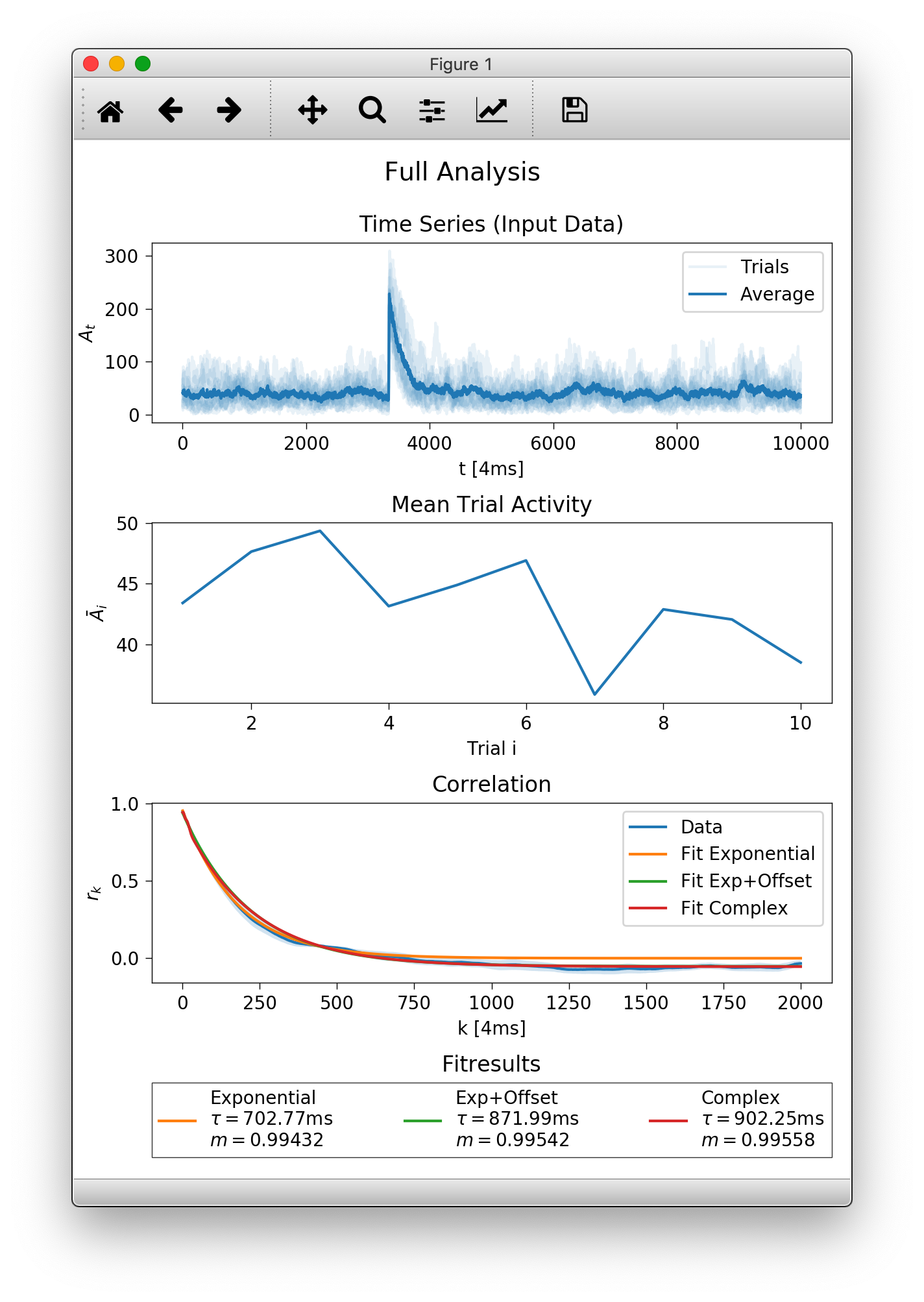
The function returns a figure (matplotlib axes element), here assigned to
auto, that only contains
the third subplot with the correlation result. If you want to plot into
an existing figure you can provide a matplotlib.axes.Axes instance
using the targetplot keyword argument.
Manual Analysis and Customization
Lets start by recreating the first subplot from above with some customization.
To plot data with default styling, we create an OutputHandler and
manually add the data we imported before as a time series.
oful = mre.OutputHandler()
oful.add_ts(srcful)
By default, if we add more than one trial at once, the data is plotted transparently. Next we add an average over trials and specify the plot color and a label.
avgful = np.mean(srcful, axis=0)
oful.add_ts(avgful, color='navy', label='average (full)')
Any kwargs (keyword arguments, think named options) are passed to matplotlibs plot function (that the toolbox uses for plotting). You can find more options to specify in the matplotlib documentation.
avgsub = np.mean(srcsub, axis=0)
oful.add_ts(srcsub, alpha=0.25, color='yellow', label='trials (subs.)')
oful.add_ts(avgsub, ls='dashed', color='maroon', label='average (subs.)')
oful.add_ts(srcdrv, color='green', label='drive')

plt.show()
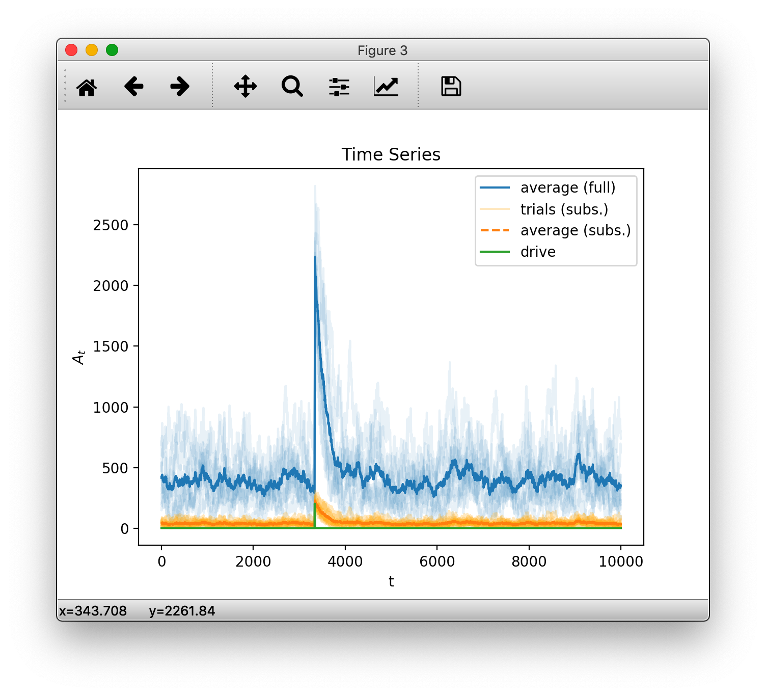
(Note: matplotlib’s ability to deal with colors has increased a lot since version 1.5.3. The code above uses backwards compatible styling but we recommend using the newer syntax e.g. color='C0', if available. See the latest matplotlib api refernces compared to v1.5.3)
So far, so good. After checking that the input is indeed what we want, we
calculate the correlation coefficients \(r_k\) using
the coefficients() function.
rkdefault = mre.coefficients(srcful, method='ts')
print(rkdefault)
print('this guy has the following attributes: ', rkdefault._fields)
coefficients() returns a CoefficientResult, which is a fancy way
for saying we put all the needed information into a structure.
One can access its content like this (for instance, to get the
coefficients \(r_k\) that were calculated): rkdefault.coefficients.
We can manually specify the time steps for which we want to calculate coefficients (and each time steps dtunit as well as the number of units per step dt)
rk = mre.coefficients(srcsub, method='ts',
    steps=(1, 5000), dt=4, dtunit='ms', desc='mydat')
Here we want all coefficients from \(1\times 4 \rm{ms}\) to \(5000\times 4 \rm{ms}\), where, again, the measurement points of our data srcsub are 4ms apart. We also provided a custom description desc that will automatically appear in the plot legend.
Next, we have to call fit() for estimating the branching parameter and
autocorellation time. Note that the resulting \(\tau\) is independent of the used
time scale but \(m\) directly depends on dt. There will be a dedicated page
showing this relation in the future.
Again, we can either use default arguments, that use the details from the coefficients function or specify some more details. Frontmost, we can specify a custom range over which to fit (without recalculating the coefficients every time) and the fitfunction to use.
m = mre.fit(rk)
m2 = mre.fit(rk, steps=(1, 3000), fitfunc='offset')
The result of the fit is again grouped into a structure, but for now
lets create a new OutputHandler and save it.
You can add multiple things to add when creating the handler, or add
them indvidually, later.
ores = mre.OutputHandler([rkdefault, m])
ores.add_coefficients(rk)
ores.add_fit(m2)
ores.save('./output/custom')

plt.show()
This should show the plot below. Note that fits are drawn dashed over the range that did not contribute to the fitting.
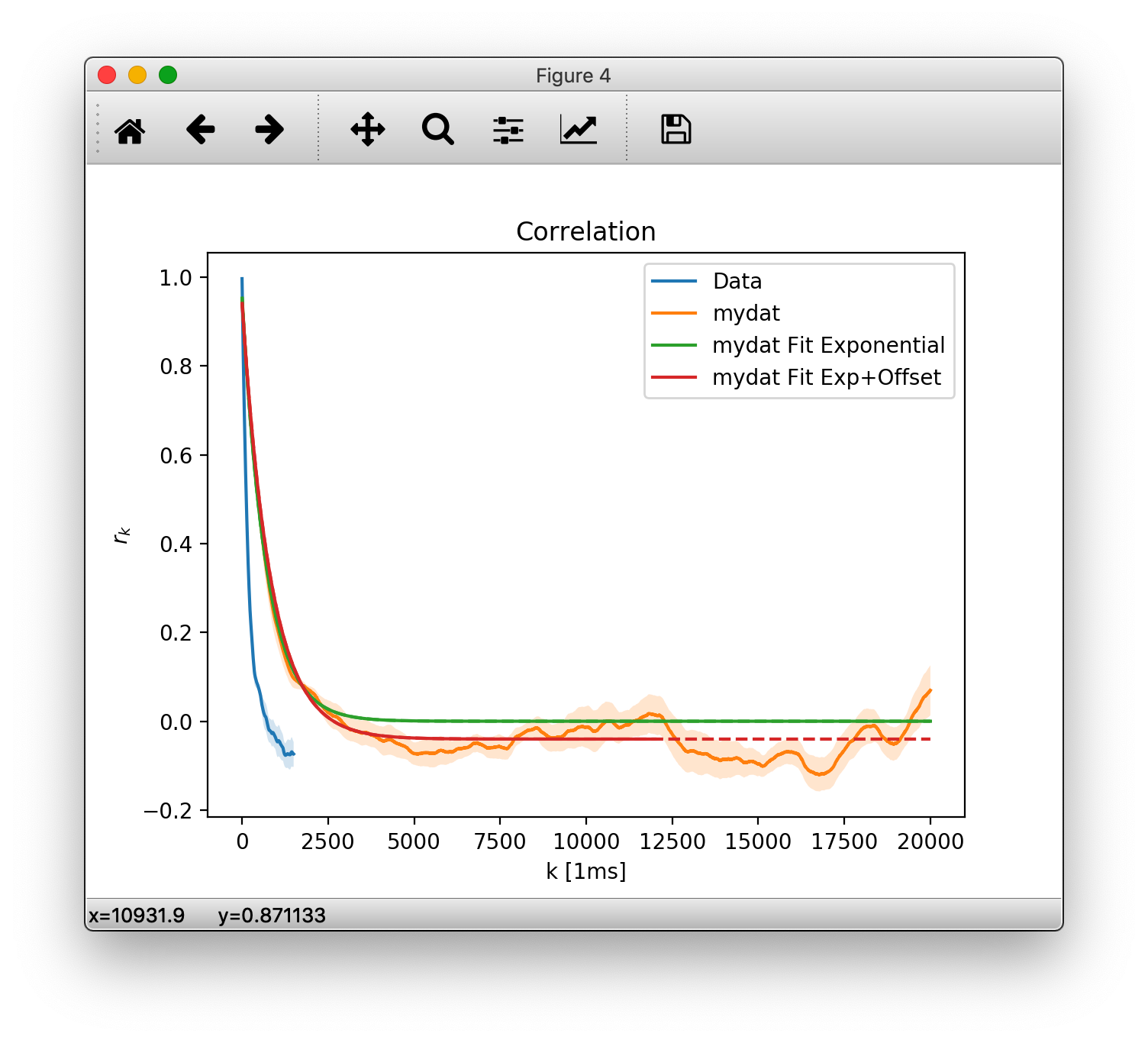
You will also find the plot as cusotm.pdf in the output save location. Along with it is the raw data in a custom.tsv (tab separated values) file. Let us look into that:
# legendlabel: mydat Fit Exponential
# description: mydat
# m=0.9943242837852002, tau=702.7549736664002[ms]
# fitrange: 1 <= k <= 5000[4.0ms]
# function: $A e^{-k/\tau}$
#   with parameters:
#       tau = 702.7549736664002
#       A = 0.957555920246417
#
# legendlabel: mydat Fit Exp+Offset
# description: mydat
# m=0.9952035404934625, tau=831.9468533876288[ms]
# fitrange: 1 <= k <= 3000[4.0ms]
# function: $A e^{-k/\tau} + O$
#   with parameters:
#       tau = 831.9468533876288
#       A = 0.9853947305761671
#       O = -0.04020540759362338
#
# 1_steps[1ms]  2_coefficients  3_stderrs   4_mydat_coefficients    5_mydat_stderrs
1.000000000000000000e+00    9.967336095137534491e-01    2.769460094101808875e-04    nan nan
2.000000000000000000e+00    9.929733724524110183e-01    6.003410730629407926e-04    nan nan
3.000000000000000000e+00    9.888006597244309859e-01    9.619184985625585079e-04    nan nan
4.000000000000000000e+00    9.842378364504643651e-01    1.344448266892795014e-03    9.453904925500404843e-01    4.286386552253950571e-03
...
In the (admittedly, quite long) header marked by #, you find the two plotted fits, their description - if set, legendlabel, fitrange, the underlying function and the parameters that were obtained.
After the fits are the column labels of the plotted data sets. First the x-axis values (steps and their units), followed by corresponding y. We first added rkdefault which had no description specified so the columns are simply labeled 2_coefficients and 3_stderrs. For the second data set we specified my_dat, so you find that in columns 4 and 5. Note that we only have data for multiples of \(4\rm{ms}\) in the later data set, so it is padded with nans.
We strongly advice keeping those meta tsv files around so you can reproduce the plots at a later time, in another plot prorgram (e.g. gnuplot is fine with this layout) or to share them with your colleagues.